The Most Eye-Catching T-Shirt Colors

The world of fashion is vibrant and colorful, yet certain hues have an uncanny knack for grabbing more attention than others. This is particularly true when it comes to something as everyday as a t-shirt. Why is it, though, that some colors seem to almost jump out at us?
Our eyes are naturally drawn to certain colors more than others, not just by chance, but due to how our vision processes light. Ever wondered why red seems to scream 'look at me'? Or why you're more likely to spot a bright yellow t-shirt in a crowd? It's not just your imagination—it's science.
In this piece, we dive deep into the colors that are most effective in catching the human eye and explore the reasons behind their potency. Whether you're a designer looking to create a standout collection or simply want to refresh your wardrobe with a few statement pieces, understanding which colors have the most impact can be incredibly useful.
- Color Psychology in Fashion
- Scientific Insights on Eye-Catching Colors
- Top Eye-Catching T-Shirt Colors
- Fashion Tips on Color Selection
Color Psychology in Fashion
Color psychology is a fascinating realm that explores how hues can affect human behavior and emotions. In the realm of fashion, this becomes particularly significant as clothing can influence mood, perceptions, and how one is perceived by others. When it comes to t-shirts, a staple in wardrobe essentials, choosing the right color can make or break an outfit. We all have experienced that moment of slipping on a t-shirt in a vibrant red hue and feeling instantly more confident, or donning a soothing blue when seeking calm. This is not simply a coincidence but rooted in the psychological and emotional reactions that different shades evoke.
Take, for example, the color red. It's often associated with energy, passion, and even danger, making it ideal for occasions where a bold statement is desired. Studies have shown that red can increase heart rate and create a sense of urgency. Then there's blue, a color frequently linked to stability and trust. In fact, many corporate settings favor blue for its association with professionalism and calmness.
"Color is a power which directly influences the soul," encapsulated by artist Wassily Kandinsky, underscores the profound impact of color on human psyche.
Meanwhile, yellow, known for its brightness and cheerfulness, can evoke feelings of happiness and friendliness. It is often used in eye-catching marketing materials, and wearing a yellow t-shirt can similarly make a person appear more approachable and radiant. It's important to note, though, that cultural differences can alter color perceptions. While white is typically a color of purity in Western cultures, in some Eastern cultures, it's traditionally associated with mourning. This cultural nuance expands the depth of color psychology in fashion, adding layers of meaning and significance.
Interestingly, the impact of color is not universally fixed but can be subject to personal experience and context. For instance, someone might perceive green, traditionally symbolizing nature and tranquility, as a color of envy or jealousy due to personal associations. Designers often leverage these psychological insights not only to craft individual garments but to also influence seasonal trends and fashion collections. As colors interact with societal trends and personal experiences, the palette of our world shifts continuously, reflecting broader narratives and personal stories.
Clothing retailers and designers utilize color psychology to create collections that resonate with consumer emotions and behavioral patterns. For instance, during stressful times, there might be a surge in sales of clothes in calming tones like pastel blues or greens, which signal comfort and security. Beyond individual selections, these psychological insights play a crucial role in strategic fashion marketing, ensuring collections not only appeal aesthetically but emotionally resonate with consumers.

Scientific Insights on Eye-Catching Colors
Understanding why certain colors like red and yellow appear more striking to us involves a fascinating mix of biology, physics, and even psychology. At the core of it, our eyes have specific types of cells called cones, which are responsible for color vision. Humans typically have three types of these cones, each sensitive to a different part of the light spectrum—blue, green, and red. This trichromatic vision allows us to perceive a broad range of colors, yet red is often noted as the most eye-catching because it stimulates all three types of cones strongly. This capability doesn't merely stand as an anecdote; it's deeply rooted in our evolution. Bright and bold hues in nature often signal ripeness in fruits or, more pressingly, serve as a warning color for danger, urging us to take note.
Taking this a step further, from a psychological perspective, colors like red and yellow have been historically associated with excitement and energy. Imagine the vibrant branding of fast food giants and the intentionally flashy headlines designed to catch our eye—these aren't random choices. These colors are chosen because statistically, they can increase heart rate and excite the human psyche. An intriguing insight from a study by the University of Winnipeg posited that color can boost brand recognition by 80 percent—talk about making a bold statement!
Moreover, research led by experts at the Pantone Color Institute often highlights how colors impact mood and perception. According to Leatrice Eiseman, Executive Director of the Pantone Color Institute, 'the human eye can differentiate over a million distinct hues, yet it’s fascinating how certain shades repeatedly surface as attention grabbers.'
She further elaborates, 'Color is a powerful communication tool and can be used to signal action, influence mood, and even affect physiological reactions.'The science is clear; colors wield an extraordinary sphere of influence over our sensory perceptions, and there's more beneath the surface than meets the eye. This is why choosing the right shirt color can make an otherwise mundane outfit stand out remarkably in a crowd.
When exploring these concepts, it’s helpful to also examine how specific environments or contexts can amplify the effects of certain colors. Bright colors appear even brighter in contrasting environments. This is exactly why a t-shirt in a vivid hue can seem to pop even more when worn against a somber, muted background. Contextual contrasts can make colors like turquoise or neon green seize attention unexpectedly. Let’s not forget the role of cultural significance and personal biases, as they too add complex layers to how different people perceive the same color differently. The impact of these dynamics can be seen clearly across various industries such as advertising, fashion, and design.

Top Eye-Catching T-Shirt Colors
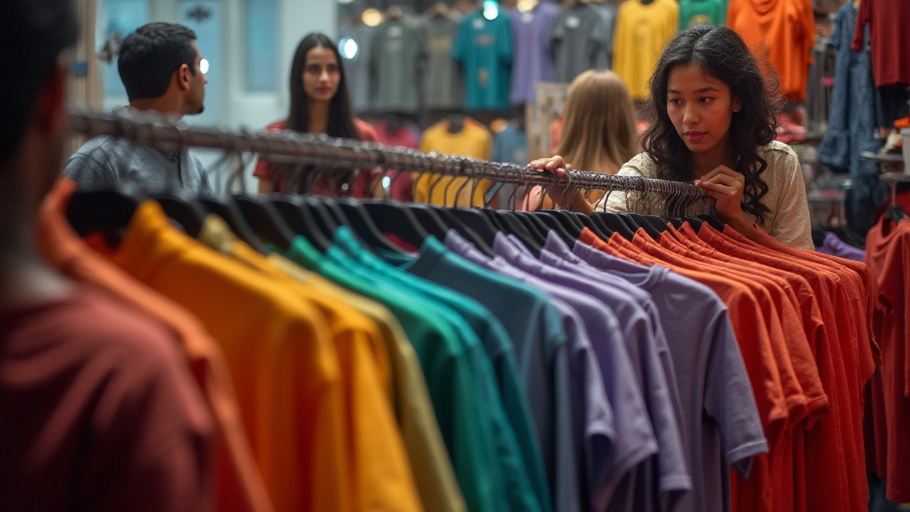
When it comes to choosing t-shirt colors that catch the human eye, understanding how color perception works is vital. Our eyes are particularly sensitive to certain hues due to the way they process different wavelengths of light. Among the most eye-catching colors, red stands at the forefront. Its vibrant nature is associated with energy, passion, and urgency, which is why it's often used in stop signs and sale tags. Studies show that red can increase heart rate, stimulating a sense of excitement. This makes it a perfect choice for a t-shirt if you want to stand out in a crowd. Beyond its vibrant appeal, the color's ability to command attention is a reason why it's frequently chosen by brands looking to make a bold statement.
Another chosen color is yellow, the color of sunshine and happiness. Known as the most visible color in the spectrum, yellow is well-loved for its cheerful and attention-grabbing characteristics. Many fashion experts agree that a yellow t-shirt can uplift your mood and is often a go-to choice for those aiming to brighten up their wardrobe. Due to its high visibility, yellow is a favorite in safety clothing and accessories but translates surprisingly well into casual fashion. One might say, "A splash of yellow can turn the ordinary into extraordinary."
Blue, particularly shades of cobalt or royal blue, is next on the list. While it might not scream for attention like red or yellow, its calming and reliable nature often draws the eye in a different way. Blue's association with tranquility and trust makes it a staple in every wardrobe. According to color theory, wearing blue can help you feel more relaxed, confident, and trustworthy—qualities that inevitably attract positive attention. Many designers find inspiration in the sky and sea, harnessing the color's natural allure in their creations.
Green, showcasing nature's palette, is another potent option. It's interesting to note that our eyes can discern more shades of green than any other color, which might contribute to its ability to stand out uniquely. Green symbolizes growth, vitality, and renewal, making it perfect for someone looking to make a subtle yet powerful impression. In the fashion world, green is often played down due to its bold nature but pairing a green t-shirt with the right accessories can create an unforgettable look.
Orange, with its warmth and enthusiasm, rounds off this selection. Often associated with creativity and joy, a bright orange t-shirt can certainly turn heads. While it may not be the traditional color for many, its ability to energize and uplift offers a refreshing change from the ordinary. In
"Orange is not the color of the wallflower," a notable fashion editor once quipped, underscoring its dynamic presence in fashion choices.These colors together form a spectrum of options for anyone looking to freshen up their wardrobe with pieces that truly capture attention. The choice of color can greatly influence how we're perceived, so it pays to be intentional about which hues dominate your wardrobe.

Fashion Tips on Color Selection
The art of choosing the right color for your t-shirts is not just about matching your favorite shade. It's an intricate dance with color psychology, lighting, and even climate. When you're picking out a t-shirt, remember that each hue tells a story and evokes an emotion. Reds are dynamic and exciting, urging people to pay attention. Blues often evoke calmness and stability, perfect for creating a relaxing vibe. Yet, the choice isn't just about personal preference but also about how the color interacts with your skin tone. People with cool undertones might find themselves glowing in jewel tones like emerald and sapphire, while those with warm undertones could shine in shades of gold and rust.
Seasonality plays a big role in color selection, too. Bright and bold hues like yellows and oranges practically scream summer. They capture and reflect sunlight beautifully, making you stand out in a crowd. During winter months, muted tones such as grays and dark greens come into play. Autumn, with its earth tones, provides an opulence that's deeply comforting. Working these colors into your wardrobe strategically can transform your seasonal look, helping you to resonate with the right mood all year round. Perhaps surprisingly, t-shirts in neutral colors still hold a versatile edge, offering a blank canvas on which to build any look.
Don't forget the power of current fashion trends, which often dictate color popularity. Pantone, a globally recognized color authority, highlights hues each year that industries, from fashion to design, often incorporate into their palettes. Staying updated with these trends can help in choosing a t-shirt color that is both trendy and appealing.
Pamela Cooperman, a fashion designer, once said, "Fashion is not just about the clothes you wear; it's about the color of how those clothes make you feel."This encapsulates the sentimental journey color helps us engage in as wearers.
Bearing occasion in mind is key. While a t-shirt in a bold, playful print might be perfect for a casual outing, the same can't be said for a business setting. Navigating what is 'informal' or 'professional' through our color choices is nuanced but necessary. For instance, pastel blues and whites often fit nicely into a semi-formal or business casual environment, providing a professional yet approachable air.
Understanding Lighting
How a t-shirt appears under different lighting conditions can also steer your decision-making process. Indoor lighting, especially that with a yellow tint, can warm up cool shades, while natural sunlight tends to enhance them. Wearing an outfit outside can sometimes reveal undertones you didn't notice inside. This is why it's crucial to try on your choices under multiple lighting scenarios.| Color | Emotion | Season |
|---|---|---|
| Red | Passion | Winter |
| Yellow | Happiness | Summer |
| Blue | Calm | Autumn |
| Green | Balance | Spring |
Finally, your geographic location and climate can affect how you perceive colors. Brighter colors are popular in sunnier places since they don't absorb as much heat, keeping you cooler. In contrast, darker colors, while chic, are better suited to cooler climates. With these factors in mind, making informed choices about t-shirt colors can elevate your fashion game by aligning with both your personal preference and socially dictated trends. As you bring these tips into practice, watch not only how it transforms your wardrobe but also the way you carry yourself in the myriad of colors now at your disposal.
- Dec, 10 2024
- Violet Greenfield
- 0
- Permalink
Written by Violet Greenfield
View all posts by: Violet Greenfield