Best Shirt Colors to Appear Friendly: A Guide with Surprising Facts
Ever notice how some people light up a room just by walking in? It's not just about energy. The color of your shirt actually does some of the talking for you. Let's admit it—when you’re deciding which shirt to buy (or which one to grab last second before a coffee date), you aren’t exactly thinking, “Will this make me look friendly?” But maybe you should. Shirt colors can make or break first impressions, trigger trust, or even put people on edge. Surprised? There’s science, real-world stories, and wild stats behind this everyday choice. So, what shirt color is actually the friendliest?
What Makes a Color Feel Friendly? The Science and Psychology
Colors aren’t just pretty. Our brains are hardwired to react to different shades in all kinds of ways. The field of color psychology—a mix of marketing, art, and brain science—shows that color actually alters our mood, the way we respond to people, and even makes us more likely to approach someone.
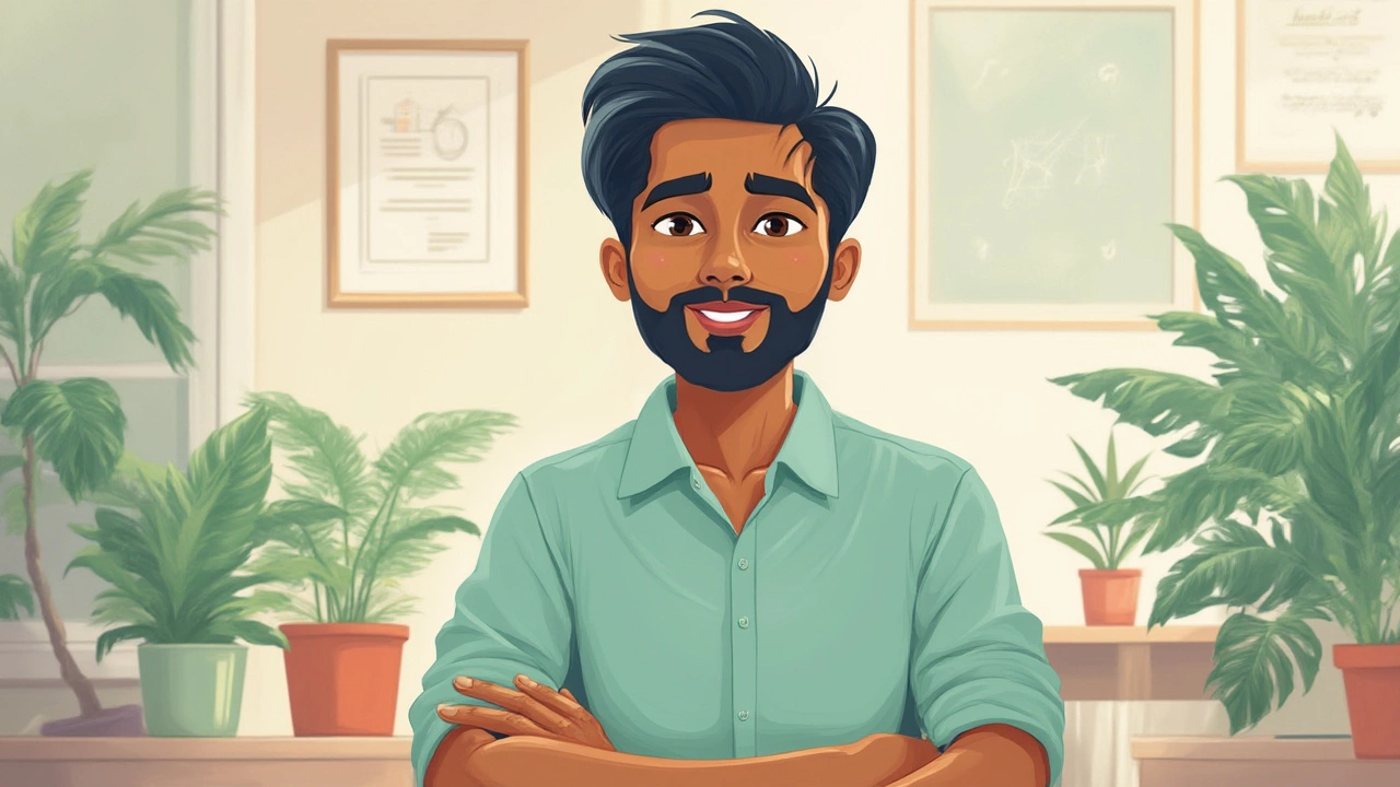
Let’s get concrete. Blue is known as the “universal favorite.” According to a survey by YouGov (2023), across 10 countries, over a third of people picked blue as their top color. It’s linked to trust, calm, and approachability. That’s not a coincidence; think about the uniforms you’ve seen in doctors’ offices, big banks, and airline staff. Blue is the top choice when brands want to say, “We’re safe, we’re open.” Light blue is softer, fresh, and studies show it makes you look even more approachable, whereas navy offers reliability with a bit more formality.
But blue isn’t the only contender. There’s also yellow—think of a sunflower or a smiley face. People associate yellow with happiness and energy. But too strong a yellow, and it might come off as loud instead of welcoming. Lighter shades, like pastel yellow, are gentle, youthful, and instantly lift the mood.
Soft greens give off a calm, earthy vibe. Green is refreshing, signaling life and growth. People feel at ease around someone in green, especially lighter shades like mint or sage.
Don’t miss out on pink, either. While pink has shed a lot of “gendered” baggage, it’s actually rated as soothing and affectionate by both men and women. Paler pinks win for warmth and friendliness—no wonder you find them everywhere from casual shirts to business-casual blouses.
So which ones do people shy away from? The science says too much black or deep grey can make you look serious or unapproachable. Red is powerful, but it’s more about energy than friendship—it can even intimidate. Yes, it gets attention, but not the warm-and-fuzzy kind.
Check out some top colors sorted by the feelings they create (according to the Pantone Color Institute and real-world marketing studies):
| Color | Feelings Triggered |
|---|---|
| Light Blue | Trust, calm, friendliness |
| Yellow (Light) | Happiness, optimism, approachability |
| Mint Green | Fresh, peaceful, relatable |
| Soft Pink | Kindness, warmth, affection |
| White | Simplicity, openness |
If you’re after that instant “let's-chat” vibe, you want colors that shorten the psychological distance and send cues of warmth, sincerity, and relaxation. It’s not magic, it’s smart dressing.
The Top Friendliest Shirt Colors with Real-World Examples
Let’s get even more specific. You’re standing in front of your closet or out shopping—what exactly should you look for?
Friendly shirt color winners: soft blue, pastel yellow, mint or sage green, and gentle pinks. Here’s why, along with stories from the world around us.
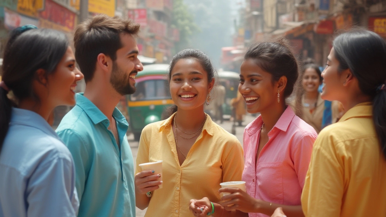
- Light Blue—Think about every single ‘casual Friday’ at work. Light blue shirts fly off the racks for that reason. Mark Zuckerberg wore his pale blue T-shirt during hundreds of public appearances—not just for the ‘tech bro’ look, but because blue naturally invites trust, even when you’re asking people to hand you their data. Even big airlines dress their staff in light blue for a calming, social touch.
- Pastel Yellow—You won’t see many CEOs in yellow, but you’ll find teachers, youth group leaders, and people working with kids wearing it all the time. Ever wonder why? Lighter yellows are associated with good moods and patience. A cafe barista in Paris told the Guardian in 2024 that whenever she wore yellow, her tip jar magically filled up faster. True or not, enough people swear by it for it to be worth a try.
- Sage/Mint Green—A TikTok poll in 2025 (over 300,000 votes!) named sage green the “most comforting color” to chat with at parties. This mellow green doesn’t just look cool; it actually makes you seem reliable but fun. School counselors often pick pale greens for their office because kids talk more openly in those spaces.
- Soft Pink—Pink is seeing a big comeback across genders. Look at Major League Baseball—did you catch all those pale pink warm-up tees last season? They gave players a down-to-earth, relatable vibe. LinkedIn’s own company culture lead said she wears pale pink to interviews to “remind people that warmth beats intimidation.”
And don’t dismiss white. A crisp, clean white shirt is like a blank canvas and reads as approachable, honest, and willing to listen. Just avoid dingy or overly formal whites (like a starchy tuxedo shirt outside a wedding).
You’d be surprised—try wearing a misty blue or soft yellow shirt next time you’re running errands or meeting friends. You might find people smile or start chatting a little sooner than usual. It’s not a fluke. They’re responding to those friendly color cues, even if they can’t put it into words. Ever notice nurses in soft pastels? Hospitals know those colors diffuse anxiety and help patients open up.
Colors to Avoid If You Want a Friendly First Impression
Sometimes it’s more about what not to wear. Black is classic and slimming, sure, but it can seem intimidating, especially if you’re meeting someone new or want to come off as relaxed. Why do high-powered CEOs and politicians wear black at serious events? Because it sets a boundary and signals authority, not warmth.
It’s the same with aggressive reds. Red is awesome on TV or when you want to make a bold entrance, but studies—including a huge experiment published in Psychological Science—found people rate others as more dominant and aggressive in red, not more approachable. So, unless you want to seem like the boss, skip head-to-toe red when you’re aiming for that buddy-next-door feeling.
Dark grays and deep browns aren’t your best bet either. They can come off as heavy or tired. Bright neon colors—those highlighter greens and pinks—might say “fun,” but they can be distracting or off-putting, especially up close in conversation. Nobody wants their shirt to feel like a blinking ad.
Same with overly busy patterns. Stripes and dots can be friendly, but if they’re too loud, it becomes about the shirt instead of you. If you love a daring pattern, keep it in softer tones or use it as an accent under a plain blazer.
Here’s a super-handy tip: before stepping out, look at your shirt in natural light. Colors shift indoors. What looks breezy in your closet can turn gloomy by a window. Soft, gentle colors rarely betray you, but dark or neon shades can change fast and send a whole other message.
You might want to keep one friendly shirt handy for days when you’re nervous about a social interaction—like meeting your partner’s friends for the first time or heading into a group interview. It’s like conversational armor, but softer.
Cultural and Contextual Color Cues: What Works Where?
Not every color means the same thing everywhere. For example, in the U.S., blue ranks as the top “trust” color, but in Brazil, green shines as the happiest, most welcoming shade. In Japan, pink is associated with spring and new beginnings, giving it a friendly, optimistic feel. Meanwhile, yellow is popular in Scandinavia, where dark winters make any brightness a mood boost.
Religious, workplace, and social settings also change the rules. White is a symbol of celebration at Western weddings, whereas in some parts of India and China, it’s tied to mourning. This doesn’t mean you have to memorize a global color code, but it’s smart to pause if you’re in a new crowd. Business settings, especially in tech or startups, favor light blues, pale greens, and pastels for their non-threatening, approachable signals.
Teenagers and young adults, especially in fashion-forward cities like Seoul, Milan, and LA, often mix traditional pastels with bold accessories—soft blue tees with bright orange shoes, or a pink shirt under a black jacket to split the difference between friendly and edgy.
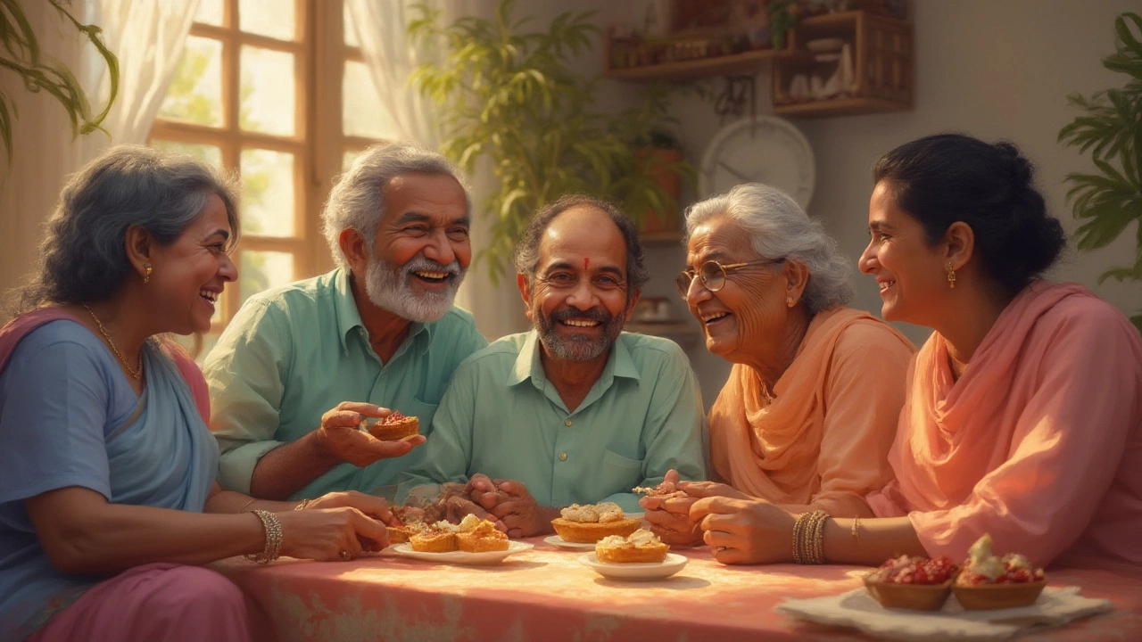
Age plays a small role. Older adults tend to get more neutral with their color wheel, but research from the British Color Council found that retired people wearing pastel blue or soft green got more positive comments during social outings than those in brown or grey. Color can actually bridge generation gaps, making it easier to strike up friendly conversations.
If you work remotely, shirts don’t disappear just because there’s a webcam involved! A 2024 poll from Zoom meeting experts found that light blue and soft green shirts got the highest “like” reactions in virtual meetings. It’s not just about pixels: those colors cut through screen coldness and create an instant welcome mat for digital chats.
So, when choosing your “friendliest” shirt, peek at the context: What’s the culture here? Am I at a barbecue, a tech meetup, or a parent-teacher night? Calibrating your color says a lot, and people notice—even if they never really realize why.
Tips and Tricks for Choosing the Best Friendly Shirt Color
You could just grab the nearest pastel and call it a day, or you could get a little strategic. Here are tricks nobody tells you in store but make a huge difference in how you’re seen—and how easy you find it to connect with new people.
- Check your skin’s undertone. Warm undertones rock peachy or salmon shirts; cool undertones look fantastic in mint, blue, or lavender.
- Use layering to soften colors. Not sure about all-pink but love the vibe? Try pink as a tee peeking out under a denim jacket.
- Patterns should play nice. Opt for stripes or small checks in light hues—these subtly invite conversation without dominating it.
- Try “color sandwiching.” Pop a friendlier color between neutrals—say, a pale yellow shirt with gray pants and a white cardigan.
- Swap heavy washes for lighter ones. Even your favorite jeans can up your “friendly” quotient if you go for lighter denim to match your shirt.
- Change it up for the season. Soft pastels look even warmer in spring, while washed-out blues cut through thick summer heat with cool, open vibes.
- Follow reactions. The next time you get a genuine compliment, take a mental snapshot: what color were you wearing?
- Accessorize for balance. If you must wear a serious blazer for that big meeting, pair it with a sky-blue or gentle pink tee underneath to soften the effect.
- Mind the mess. No shirt is friendly if it’s stained or wrinkled. Neatness gives even simple colors an approachable glow.
The easiest mistake is thinking friendliness means “plain.” It doesn’t. Friendly means inviting, light, and comfortable—colors that remind people of bright mornings, open skies, and places they want to be.
So, if you want to look more approachable, skip the black-on-black power move now and then. Invest in a few light blues, soft pinks, and gentle greens or yellows. People might not remember the exact shade, but they’ll remember how you made them feel: at ease, open, maybe laughing by the end of it. And let’s be real, if a shirt makes your world just a bit friendlier, isn’t that worth the hanger space?
- Jul, 22 2025
- Violet Greenfield
- 0
- Permalink
- Tags:
- friendly shirt color
- best colors to wear
- color psychology
- approachable outfits
- shirt fashion tips
Written by Violet Greenfield
View all posts by: Violet Greenfield